WKND 01: Bug Game Engine
Posted 12 years, 7 months ago in Weekend ProjectsWell, where to begin.... ok. So feeling inspired by Jennifer Dewalt's 180 projects in 180 days I thought it would be in my best interest to try and just make something each weekend.
Sometimes it will be a design project such as an illustration, sometimes a code project like this week's Bug JS engine. Other times it may just be a part of a thing on Dribble or following a tutorial.
The Result
 Click the screenshot to view the demo.
The Goal
The goal of the project is really just to have fun and make things. I've spent too much of my time on big pie-in-the-sky projects that either become obsolete, abandoned, or nothing is gained until after months of work. This time it is about just going for it and doing the best job that I can. Ideally I'm hoping it will inspire me more, try new technologies, and learn to make better things, quicker.
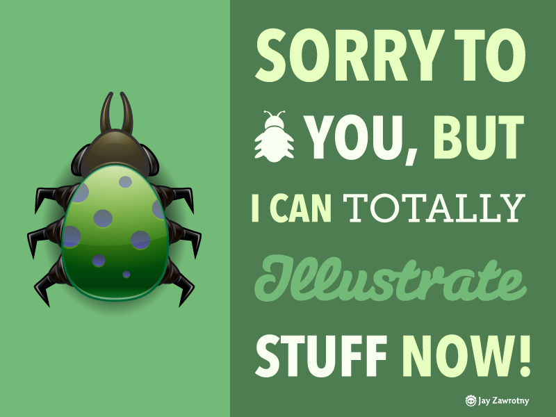
WKND01: BUG GAME
Process
This is the first project I made. First I illustrated a bug in Adobe Illustrator, it was a fun lesson in using Adobe Illustrator's Shape Builder tool which was new to me and a total godsend for creating organic shapes.
Then I wrote a JavaScript system to render that bug onto the canvas and allow the user to move it across the screen using the arrow keys. The system works by triggering events between JS objects with an event listener looking for which arrow key has been pressed and queuing a move to manipulate an entity on the screen. This way we can synchronously manage asynchronous events thus giving us the ability to handle things in "turns" or rounds which is currently based off a 10ms timer.
Application
I see this being useful for two things:
- First, getting familiar with the HTML5 Canvas
- Second, starting a JS game engine library. Now that I've tackled movement, I can now move into applying rotation, then animation, then some enemies followed by game UI.
Technologies
- JavaScript
- HTML5
Tools
- Git
- TMUX
- VIM
- Adobe Illustrator
- Google Chrome
What I Learned
I learned a lot about game system development from this. On one hand it made it a little bit more concrete for me but on the other hand the mountain has grown significantly from what I was initially expecting.
Additionally I found the HTML5 canvas to be an interesting environment to work with. I expected something along the lines of manipulating objects on a stage like Flash but instead its more like you set properties then draw them then you have to clear the screen, apply any changes, then finally draw objects again.
Rotation was in the original plans to orient the bug in whatever direction the user moved, however there seems to be an issue dealing with the origin of the bug where applying rotation moves the bug off screen. I'm not entirely certain about how to fix it but in future weekend projects I will make rotation based experiments in the HTML5 canvas.
All-in-all it was a fun first project and I'm excited for next weekend to come up with something else. At this moment I'm thinking of working with the JS library skrollr and making a scroll-based animation page with it.
Lastly, to setup the deployment of this project I finally got a chance to use Fabric which is a system written in Python that can be used to prepare & deploy projects to a server using git or many other methods. This reduces the number of steps needed to manage launching these and opens some doors to streamline future client projects or the likes of.